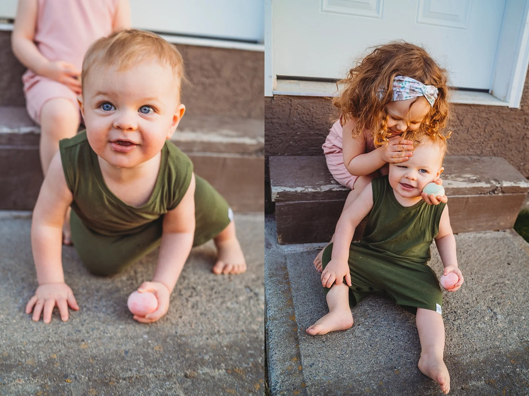
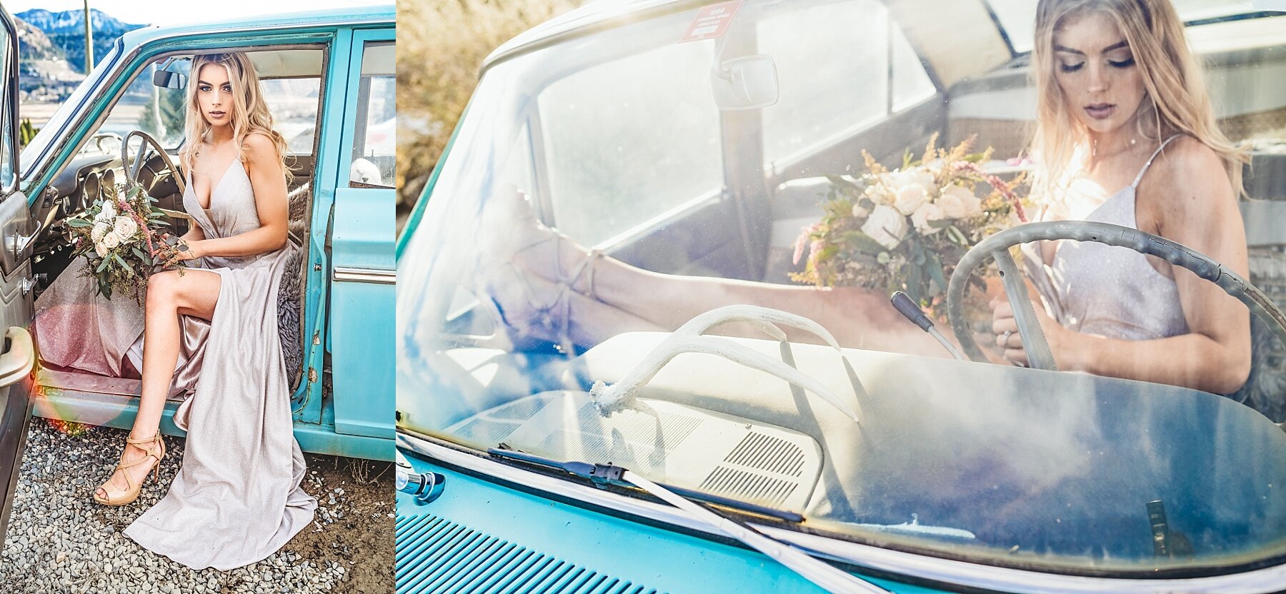
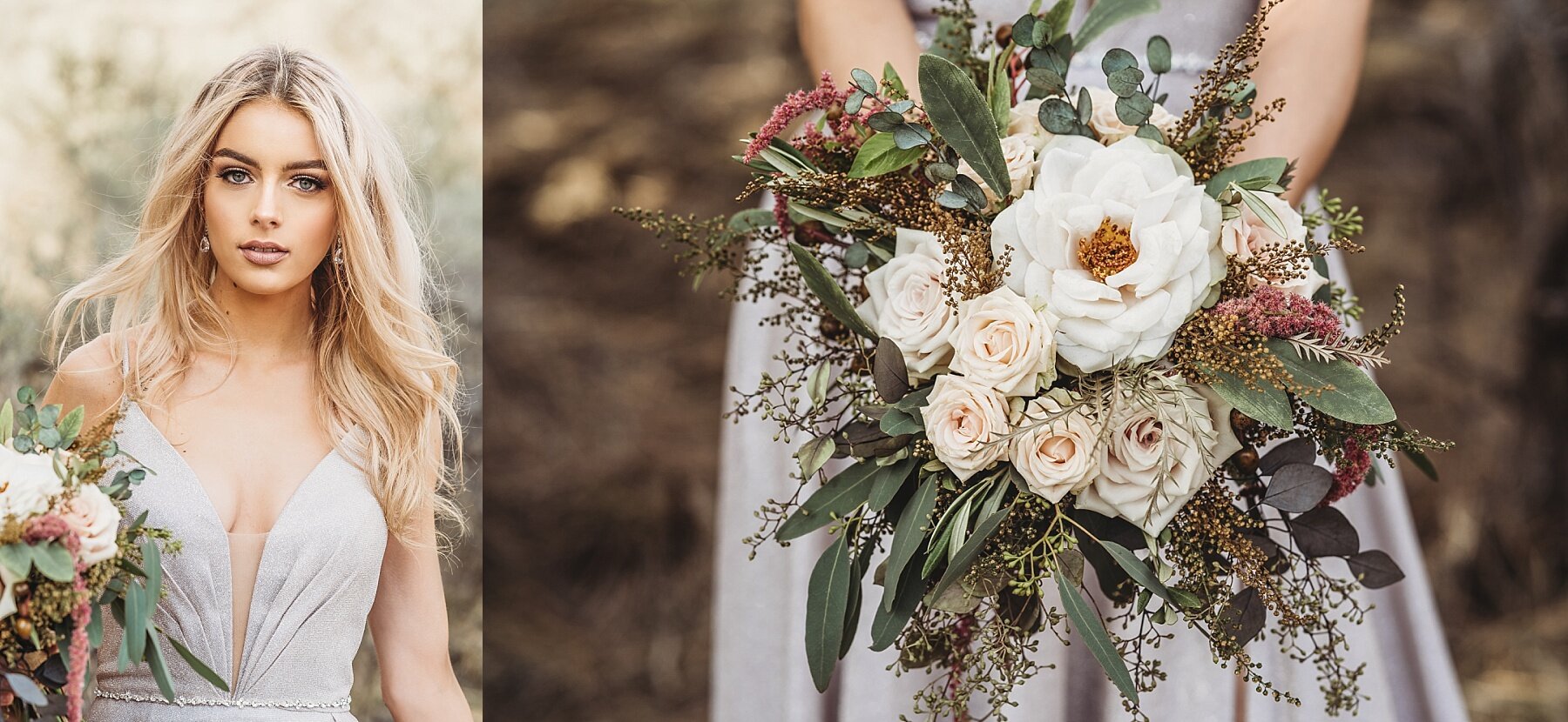
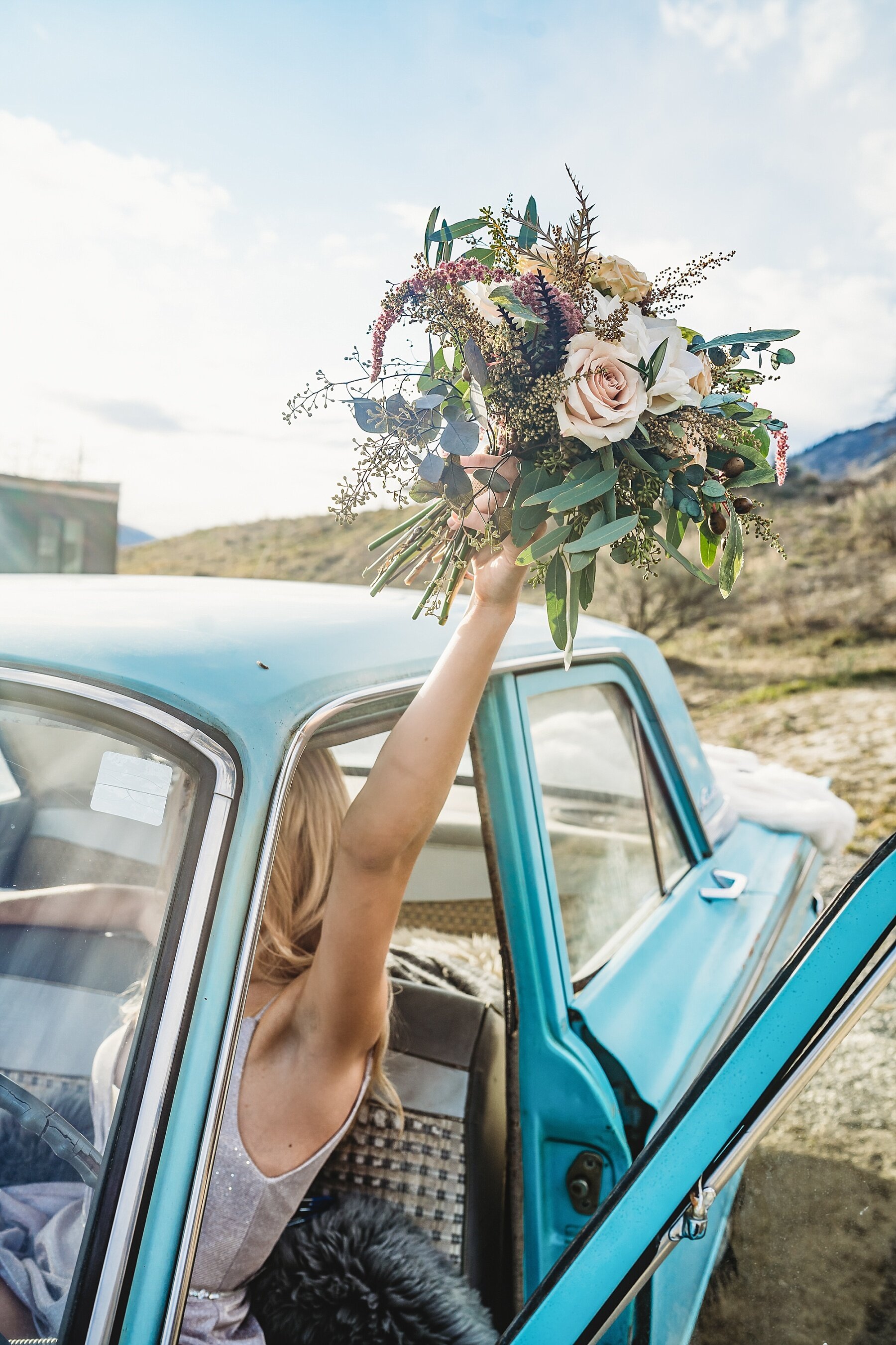
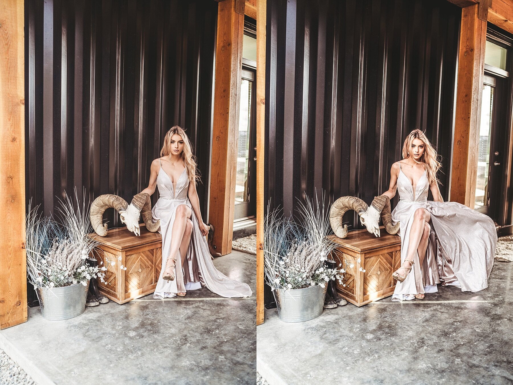
https://www.tappedevents.com/
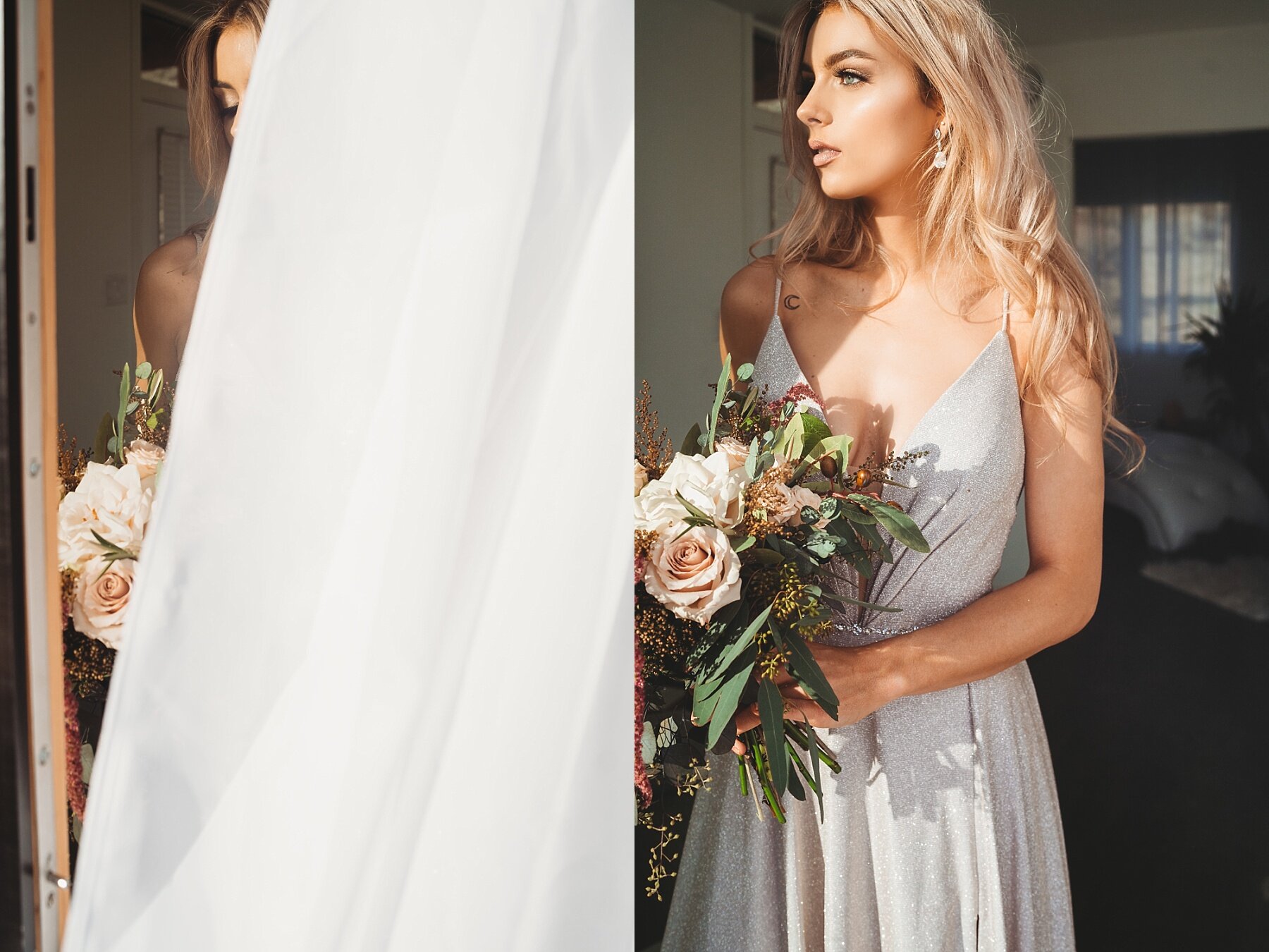
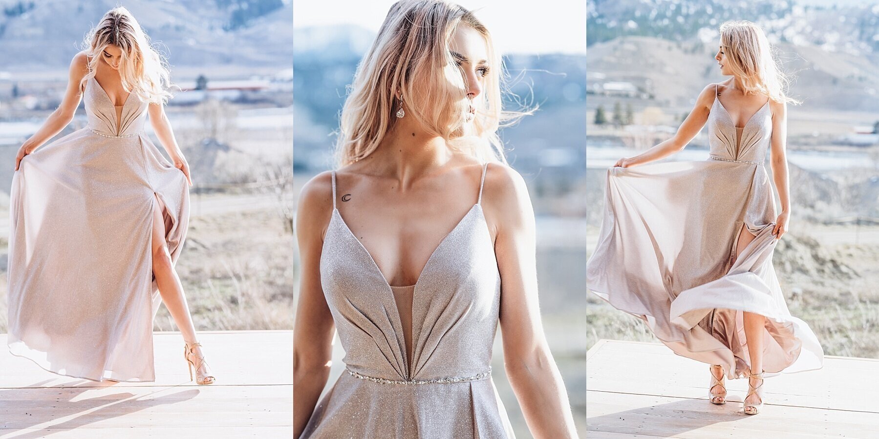
This personal branding session from just last month was SO FUN! Which is exactly what it needed to be. Because I worked so closely with Jody on the styled shoot with The Tapped Truck last summer I knew that she liked my true to life but vibrant/romantic editing style. We want the red truck to stay red, the blues to stay blue and the amber beer to POP! I edit true to colour for most branding sessions because I want my clients to be able to easily integrate their own photos into their feeds without a preset. (Though personal preset creation is absolutely an option, just send me a message on that!)


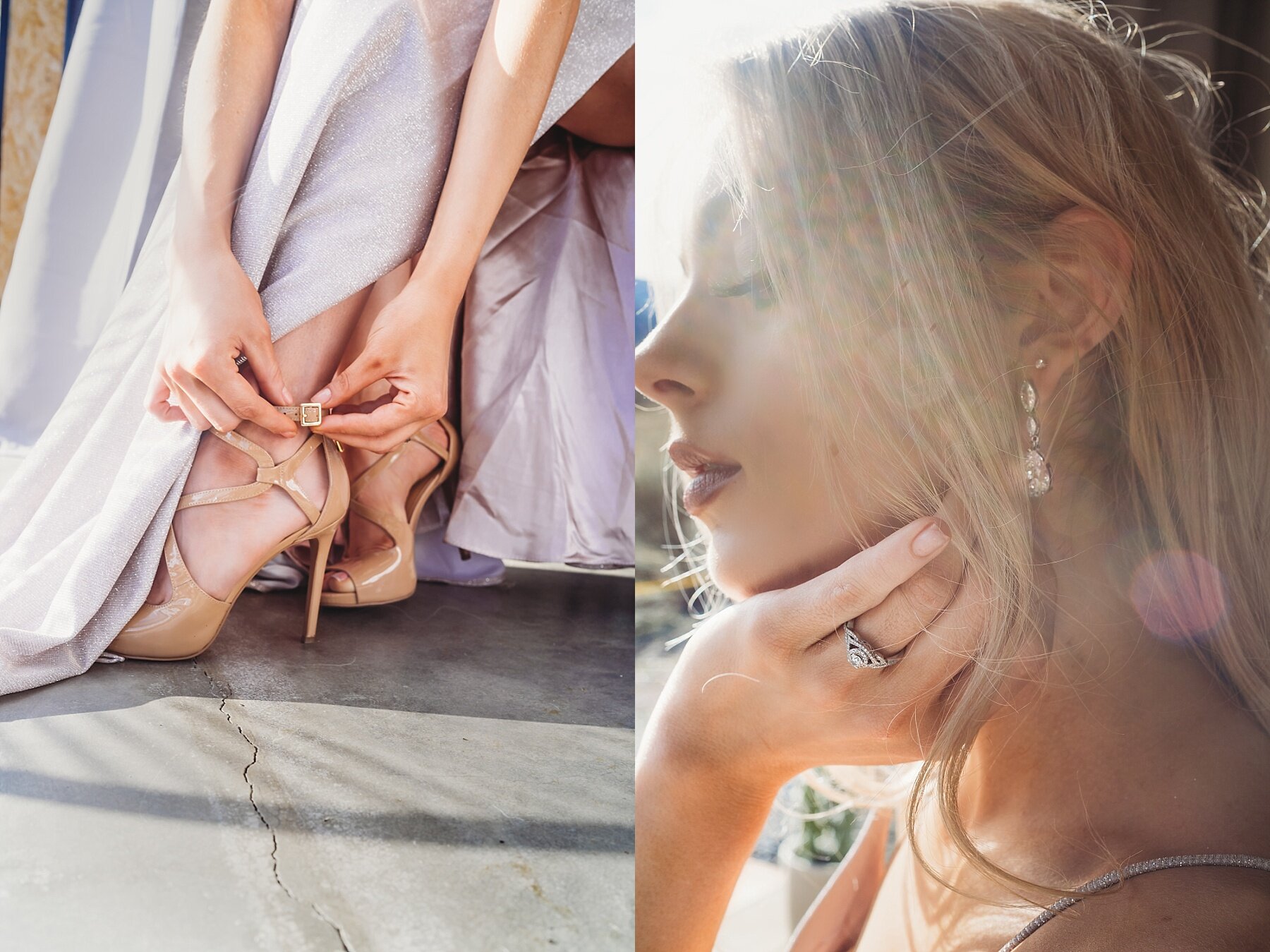
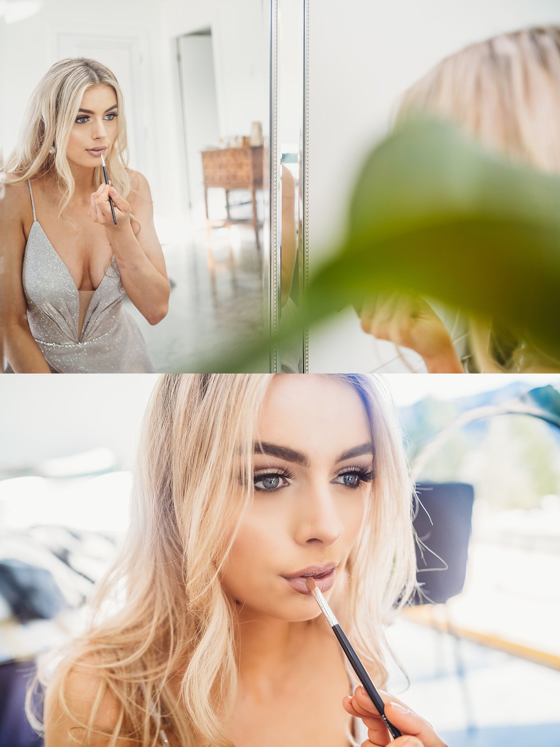
https://www.lemonthistle.com/
Colleen Pastoor from Lemon Thistle already had a wonderful and completely established brand. We chatted before hand about editing style and preference and we agreed that she would send over her preset for me to apply to her images which I was more than happy to accommodate. There are photographers that won’t do that, and I understand that point of view as well. When you hire a photographer, you choose someone for their vision, their art blah, blah, blah. But at the end of the day I want folks to be happy with their images, to use their images and to come back to me every quarter for some updated ones. 😉
As you can see from the comparison photo our editing styles were quite similar! But she designed the preset with her home, her brand and herself in mind which I think is AMAZING. And honestly it made my job waaaay easier.


https://www.cocoadotcakes.com/
At first glance, these image don’t fit. But the way that Cocoa Dot Cakes integrates images into their feed makes it work. I work collaboratively with all my clients to reach the final product. If it is not as desired I have no problem going back in and adjusting. I did mention that my whites tend to be brighter than their current feed, but as we move more towards spring and summer that’s the direction a lot of the images take. Megan already has an established brand but also receives content from multiple photographers so I wanted a style that is fresh and neutral to accommodate that.

https://greenminidesigns.ca/
And lastly this shoot for Green Mini Designs contracted through Mastermind Studios! Things can always be a little trickier when you have no contact with the client. Luckily the folks at Mastermind made sure I was fully briefed. We wanted these images to be bright, vibrant and pop with crunchy blacks and something that made you just want to look at it a second longer. I’m so happy with how these turned out and to see them implemented on Peter’s website. It was definitely a shoot I count myself lucky to have worked. Green Mini Designs is a new company so getting to help in a small way with their branding was such a super experience!